Back to blogs

Best Outfit Colors for a Golden Hour Pre-Wedding Shoot
Introduction
One of the most popular times for pre-wedding photography is the golden hour, the short period of time just after sunrise or just before sunset. It has soft, warm and appealing natural light. The amazing light has a dramatic effect which makes skin tones, landscapes and costume details look fantastic. But as important as choosing the perfect backdrop are the right colours for your golden hour pre-wedding shoot attire.
Some colours may look dead or lost their punch but others may reflect the warm light wonderfully. A carefully planned pre-wedding shoot styling will provide you timeless, well balanced photographs that are fitting for the setting and your partner’s outfit. This groom costume colour guide will help you pick colours that will work with golden hour lighting, making your pre-wedding images elegant, bright and memorable for years to come.
What Is Golden Hour & Why Does It Matter?
Golden hour photography is the time immediately after sunrise and directly before sunset when the sun is low in the sky. The light of nature is softer, warmer, and more beautiful at this hour, compared with the brutal brightness of noon. Warm light also brings out skin tones in pre-wedding golden hour images, making them look more vibrant and natural.
Another advantage is the cinematic effect, where the golden sunshine adds depth, warmth and romantic feel to each frame. Fabrics such as linen, silk, velvet, jacquard are more alive to the touch, and richer in colour. Precise golden hour styling ensures your outfit doesn’t clash with the lighting, but works with it. A timeless pre-wedding photo can be created if colours that complement the sun's warm hues are chosen, presenting itself with a delicate and polished look, with a visually balanced composition.
How Light Affects Outfit Colours?
The lighting has a great deal to do with the colour of the clothing in a photograph. When photographing during golden hour, the warm lighting can soften some colours and enhance others, so it’s important to choose the proper colours for an outfit. Light shades like ivory, beige and pastel blue perfectly reflect the golden sunshine and lend an image of freshness and elegance.
The wine, charcoal grey and navy give contrast and depth without being too hard on the eye. This is also a time when shadows soften, so you can see surfaces and clothing details, not hide them. The way textiles reflect light is equally important. Fabrics that are too shiny might cause unwanted reflections, whereas natural fabrics such as linen, raw silk and jacquard reveal the grain. A useful colour guide will allow you to choose colours and fabrics that complement the lighting, not distract from it. These simple pre-wedding photography tips can make your dress look more exquisite, and your images look more timeless and well-balanced.
Best Outfit Colours for Golden Hour
Ivory & Off-White
- Best outfit type: Sherwani, linen suit, tuxedo
- Ideal shoot theme: Royal, Modern Luxury
- Best location: luxury hotels and gardens
- Skin tone suitability: nearly all skin tones are flattered, particularly those with medium and darker complexions.
Beige & Sand
- Best outfit type: Linen suit, blazer, Indo-Western
- Ideal shoot theme: Beach, Minimalist, Garden
- Best location: Beaches, parks, cafés, open landscapes
- Skin tone suitability: works nicely on natural skin tones that are neutral and warm.
Cream
- Best outfit type: Sherwani, Bandhgala, tailored suit
- Ideal shoot theme: Traditional, Romantic
- Best location: Gardens, luxury resorts
- Skin tone suitability: complements medium, wheatish, and light colour tones.
Sage Green
- Best outfit type: Indo-Western, suit, blazer
- Ideal shoot theme: Garden Romance, Modern Outdoor
- Best location: Botanical gardens, vineyards, forest settings
- Skin tone suitability: Most skin tones can use it, especially those with warm undertones.
Powder Blue
- Best outfit type: Suit, blazer with chinos
- Ideal shoot theme: Beach, Modern Luxury
- Best location: Beaches, lakesides, luxury hotels
- Skin tone suitability: Looks excellent on fair, medium, and wheatish skin tones.
Olive Green
- Best outfit type: Suit, Bandhgala, Indo-Western
- Ideal shoot theme: Vintage, Nature, Urban
- Best location: Forests, heritage streets, gardens
- Skin tone suitability: particularly attractive to people with darker and medium skin tones.
Dusty Pink
- Best outfit type: Blazer, suit, Indo-Western
- Ideal shoot theme: Romantic, Garden, Luxury
- Best location: Floral gardens, resorts, cafés
- Skin tone suitability: When worn with neutral accessories, it looks good on most complexion tones.
Wine & Burgundy
- Best outfit type: Velvet tuxedo, sherwani, Bandhgala
- Ideal shoot theme: Royal, Bollywood, Evening Luxury
- Best location: Palaces, luxury hotels, heritage venues
- Skin tone suitability: enhances all skin tones, especially those with medium and darker skin tones.
Colours That Create Maximum Contrast
Darker colours provide a magnificent contrast to the warm light of the sky, and gentler colours work nicely with the golden hour. A well-fitted dark-coloured groom apparel brings depth, dimension and a polished look. Navy blue is a timeless shade that works well in luxury hotels, historic locations and cityscapes. Charcoal grey is a chic alternative that works well for modern architecture and metropolitan pictures.
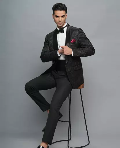
Forest green goes well with golden sunlight, and fits very well with gardens and woodland environments. Black may also be a terrific choice for tuxes worn for late golden hour or evening shooting at posh hotels and rooftop settings. When coupled with lighter accessories, it creates a dramatic, journalistic appearance that doesn’t overwhelm the setting. These suit shades are ideal for pre-wedding photo ideas when the lighting is strong, allowing the attire to be the main attention. If you want to go for something stunning and still classic for a pre wedding look, then opt for darker shades.
Colours to Avoid During Golden Hour
In pleasant evening light, not every colour is attractive. One of the easiest methods to avoid typical pre-wedding styling errors is to stay away from the wrong hues. Highly saturated hues like neon green, brilliant orange, fluorescent yellow, and others can overpower the natural beauty of golden hour and take center stage in a picture.
Large patterns tend to clash with the gorgeous background creating a cluttered feel for the arrangement. Highly shiny reflective materials can soak up direct sunlight and provide unwanted glares which take away from the elegance of the ensemble. Instead, pick naturally photographed matte or lightly textured materials. Also, being aware of which colours to avoid in your pictures will help you build a timeless and balanced style. Avoid these common groom costume mishaps and the surrounding scenery, your outfits and the warm golden light will all come together in unison for every photo.
Outfit Colour Recommendations by Shoot Theme
Royal
Choose rich and elegant tints such as white, cream, gold, burgundy, emerald green and maroon. These colours go well with sherwanis and bandhgalas, adding to the opulence of palaces and heritage places in the golden hour.
Beach
The best beach shoot colours are soft and breathable. Beige, sand, white, powder blue, sage green and light grey reflect the warm sunlight naturally while giving a fresh and comfortable look.
Garden
Earthy and pastel tones work well in garden settings. The colours sage green, olive green, dusty pink, cream and beige all go well with nature and flowers, making for soft and beautiful photos.
Vintage
Charcoal grey, navy blue, olive green, brown and burgundy are classic, understated colours that look nice in vintage themes. These shades are ideal with traditional suits, tweed jackets and heritage locations yet still have a classy feel.
Bollywood
Designer sherwanis, velvet tuxedos and contemporary Indo-Western costumes look stunning in rich shades.
Modern Luxury
Today's premium style is all about clean colour palettes and refined neutrals. Ivory, off-white, charcoal grey, navy blue, black and beige are colours that produce a refined look appropriate for luxury hotels, rooftop venues and contemporary architecture.
Outfit Colours Based on Location
Palace
The colours match the grandeur of the architecture and go well with traditional attire like sherwanis and bandhgalas.
Beach
For beach colours go for light and airy colours like beige, sand, white, powder blue, sage green and light grey. They reflect the natural sunshine, giving a new and pleasant view to the sea and the sky.
Garden
Gardens look best in soft, earthy tones such as sage green, olive green, dusty pink, cream and beige. These colours highlight the vegetation and bring warmth and beauty to your images.
Studio
Light or dark colours work for studio shoots as you have more versatility. Clean high-contrast portraits in ivory, charcoal grey, navy blue, black and burgundy according to the background and lighting.
Urban Streets
Navy blue, charcoal grey, olive green, black and white are all classy tones that go well with modern city sites. These colours are suitable for modern buildings and give a sleek editorial look.
Luxury Hotel
Luxury hotels are perfect for sophisticated colour palettes such as ivory, black, navy blue, wine, emerald green and beige. These colours are ideal for upscale interiors and go well with tailored suits, tuxedos and beautiful Indo-Western clothing.
Matching Your Outfit Colour With the Bride
Photographs of a well-coordinated couple are always better than those of a couple wearing the same colour. Selecting shades that complement one another while making both ensembles stand out is essential to a successful groom outfit match with the bride in a pre-wedding photo session.
Classic and stylish colour combinations are ivory and gold, beige and sage green, or navy and silver. Warm and cool tones need to be balanced too. Powder blue, charcoal grey and light green work well with colder colour schemes, while warm hues such as cream, wine and olive suit warm-toned bridal clothes. A good coordination of hues helps to create a visually harmonious look without making the outfit look boring. The goal is to create complimentary pre-wedding outfits suitable for both couples.
Choosing Colours Based on Skin Tone
Fair
Warm and contrasting colours work nicely for fair skin tones. Excellent options are wine, burgundy, charcoal grey, navy blue, olive green, sage green, and powder blue.
Wheatish
Wheatish skin tones may wear a variety of shades effectively. Ivory, cream, beige, emerald green, maroon, navy blue, olive green and dusty pink when combined together give a rich and well balanced effect. These shades are warm and bring out the warmth of the skin without overpowering.
Medium
Medium skin tones look beautiful in earth and jewel tones. Sage green, forest green, burgundy, charcoal grey, cream, beige and royal blue shoot well and are good with golden hour lighting.
Deep
Deep skin tones look good with rich colours and gentle neutrals. Ivory, off-white, mustard gold, emerald green, wine, burgundy, navy blue and olive green are great contrasts and accentuate face characteristics in natural light.
Fabric & Colour Combination Tips
Linen
Linen lends a delicate natural touch to hues. Fresh and easygoing shades like beige, white, sage green, powder blue and sand make linen perfect for beach, garden and outdoor shoots.
Velvet
Velvet brings depth and texture to deep, rich colours. Burgundy, emerald green, navy, black, and wine appear opulent on velvet; thus, it is great for the royal and evening-themed photos.
Raw Silk
Raw silk has a little lustre which brings out colour without too much reflection. Elegant in ivory, cream, gold, maroon and olive green, they combine well with traditional and heritage-inspired clothing.
Jacquard
The patterns of Jacquard fabrics are more apparent in the light of the golden hour. Charcoal grey, navy, burgundy, cream and gold add to the texture of the fabric, while keeping the look sophisticated.
Wool Blend
Structured silhouettes and depth of colour come from wool-blend materials. Navy, charcoal grey, forest green and burgundy are classy choices for fitted suits and tuxedos, particularly for modern luxury pictures.
Cotton Blend
Cotton blends photograph naturally and have a clean, matte look. Light colours like ivory, beige, sage green, dusty pink and powder blue are pleasant and excellent for daytime pre-wedding sessions.
Rent vs Buy: Experimenting With Premium Colours
If you are not constrained to one outfit, it is easy to pick the proper colour. Most grooms prefer to rent pre-wedding outfits for more flexibility, rather than purchasing a costly outfit that they may only wear once. Renting means you may test out designer collections in the hottest colours like sage green, white, powder blue, burgundy and olive green without the big commitment of buying.
A designer men's rental also allows you to try out a variety of designs for different photography themes, locations or lighting. You can wear a light linen suit for a beach shoot and a rich velvet tuxedo for a nighttime one without purchasing two expensive suits. This is especially beneficial for couples who are preparing diverse pre-wedding ideas.
Colour Planning Checklist Before the Shoot
- Shoot timing confirmed - Schedule your session during golden hour to get warm and natural tones when choosing your colours.
- Theme finalized - Choose colours that complement the entire ambiance, whether it is royal, coastal, vintage or modern luxury.
- Location selected - Select colours that are complementary to the environment, like light neutrals for beaches or deep tones for history places.
- Bride's outfit finalized - Instead of trying to match your colours to your partner's dress, make the colours work together.
- Skin tone considered - Select colours that will improve your skin tone and look good in natural light.
- Accessories coordinated - Match the colour of your shoes, pocket square, stole, watch and other accessories to the colour palette of the clothing.
- Trial photos taken - Before the session, take several test pictures in natural light to check how the colours and textiles seem.
Conclusion
More impact on your images will come from choosing the right golden hour pre-wedding session wardrobe hues than wearing the most expensive outfit. Using colours that harmonise with the bride’s dress, compliment the shoot location, enhance the warm natural light and suit the chosen subject achieves a balanced and classic design.
If you favour earthy tones, rich jewel hues or mild neutrals, careful colour selection makes every frame better. By focusing on the greatest colours for the pre-wedding session and pairing them with the right fabrics and styling, you can create elegant, unforgettable images that remain stylish long after the wedding celebrations are over.
FAQs
Which outfit colours look best during a golden hour pre-wedding shoot?
Soft neutrals such as white, cream, beige, sage green, powder blue and rich tones such as wine and burgundy photograph wonderfully during golden hour.
Is ivory better than white for golden hour photography?
Yes, ivory is a softer reflection of warm natural light than dazzling white. It gives a balanced, elegant look while still showing the detail of the fabric in pictures.
Can I wear black during a golden hour pre-wedding shoot?
Black is good for tuxedos and formal wear. Black is a wonderful contrast Perfect for luxury hotels, metropolitan locations and night time golden hour shoots.
Which colours photograph best with sunset lighting?
Warm colours such as ivory, cream, beige, sage green, olive green, powder blue, wine, burgundy and navy blue blend nicely with the warm glow of sunset and can create everlasting photos.
How do I match my outfit colour with my partner's outfit?
Choose colours that are complementary and of a similar level of formality and not the same shade. Coordinated colour palettes make the couple seem more balanced and natural.
Which colours should I avoid for a golden hour photoshoot?
Avoid neon colours, fluorescent colours, loud designs, very bright white and highly shiny textiles as they can distract from the warm natural lighting.
Is renting different coloured outfits better than buying one?
Yes, renting gives you access to a variety of designer shades, perfect to fit a range of shoot locations.
How do I choose the right colour based on my shoot location?
Soft neutrals are good for beaches and gardens. Rich jewel tones are good for palaces. Navy, charcoal grey and black are perfect for luxury hotels and city places.
About the Author